Brand | Print
Orange is the New Black
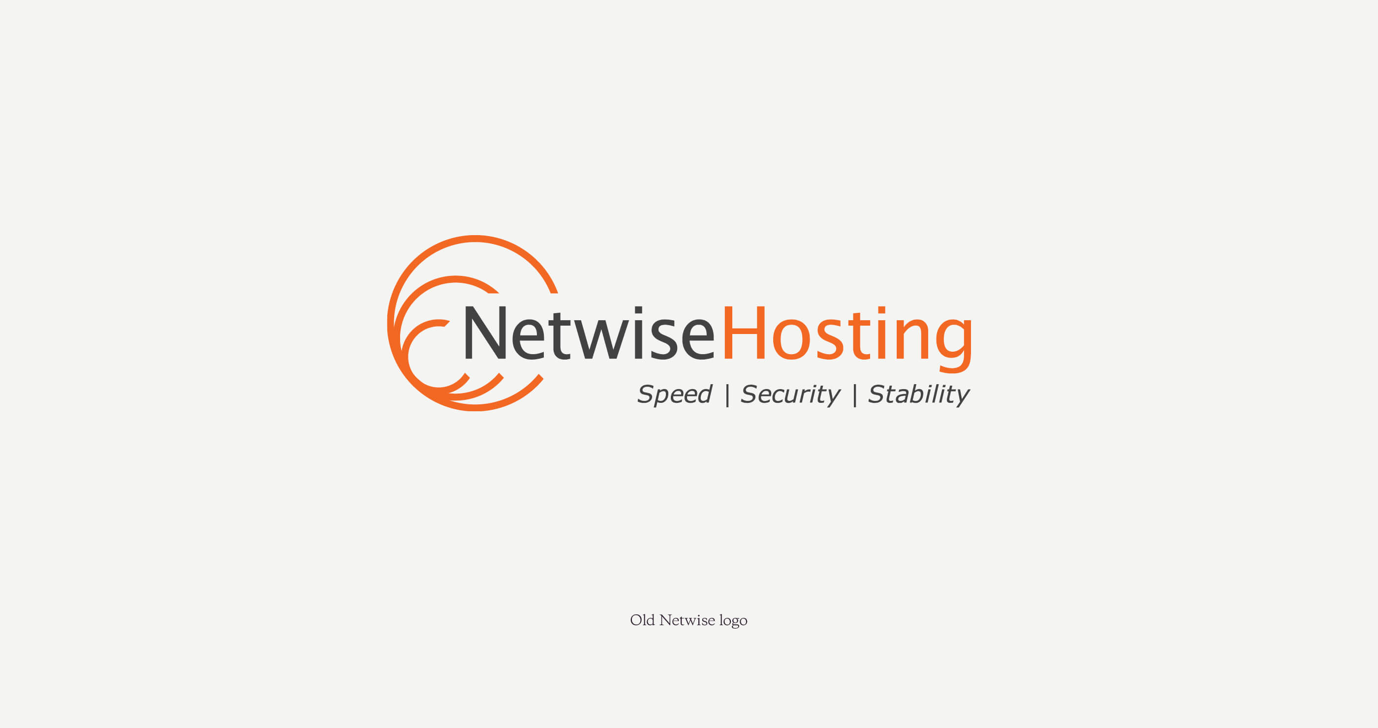
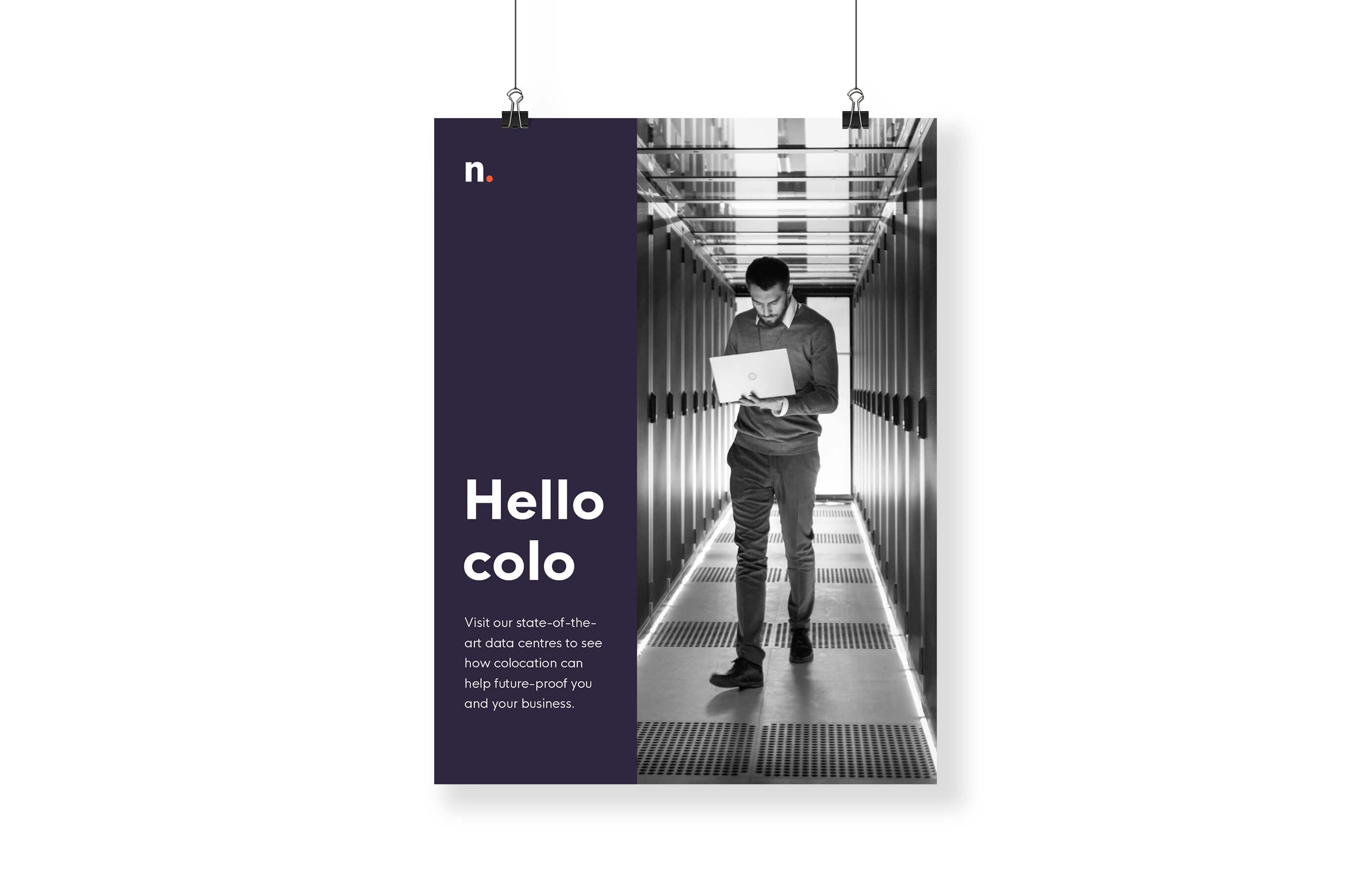
Having grown into one of the UK’s leading colocation service providers, Netwise needed a new corporate identity
that would better reflect their modern approach to business, global reach and state of the art facilities.

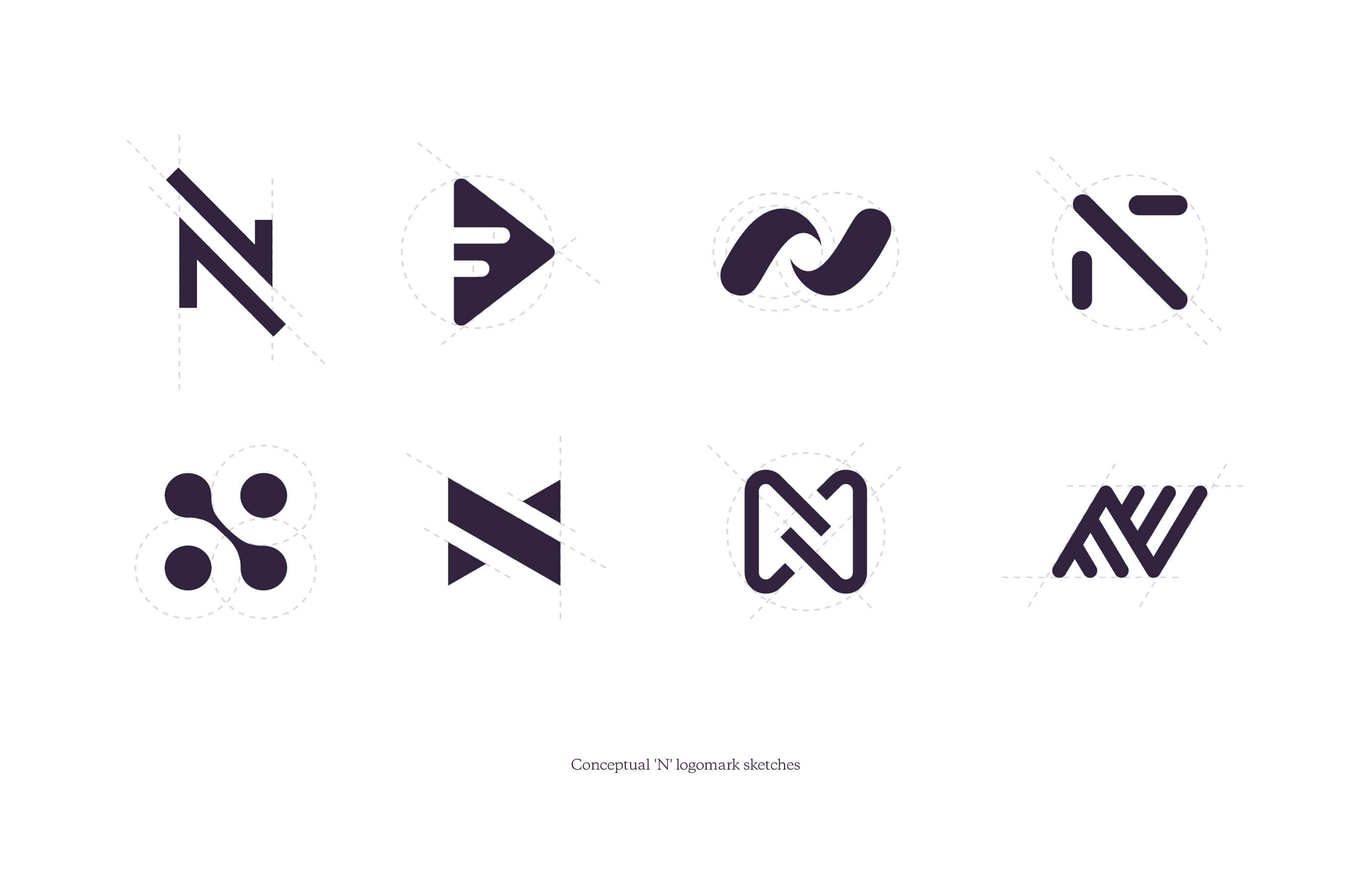
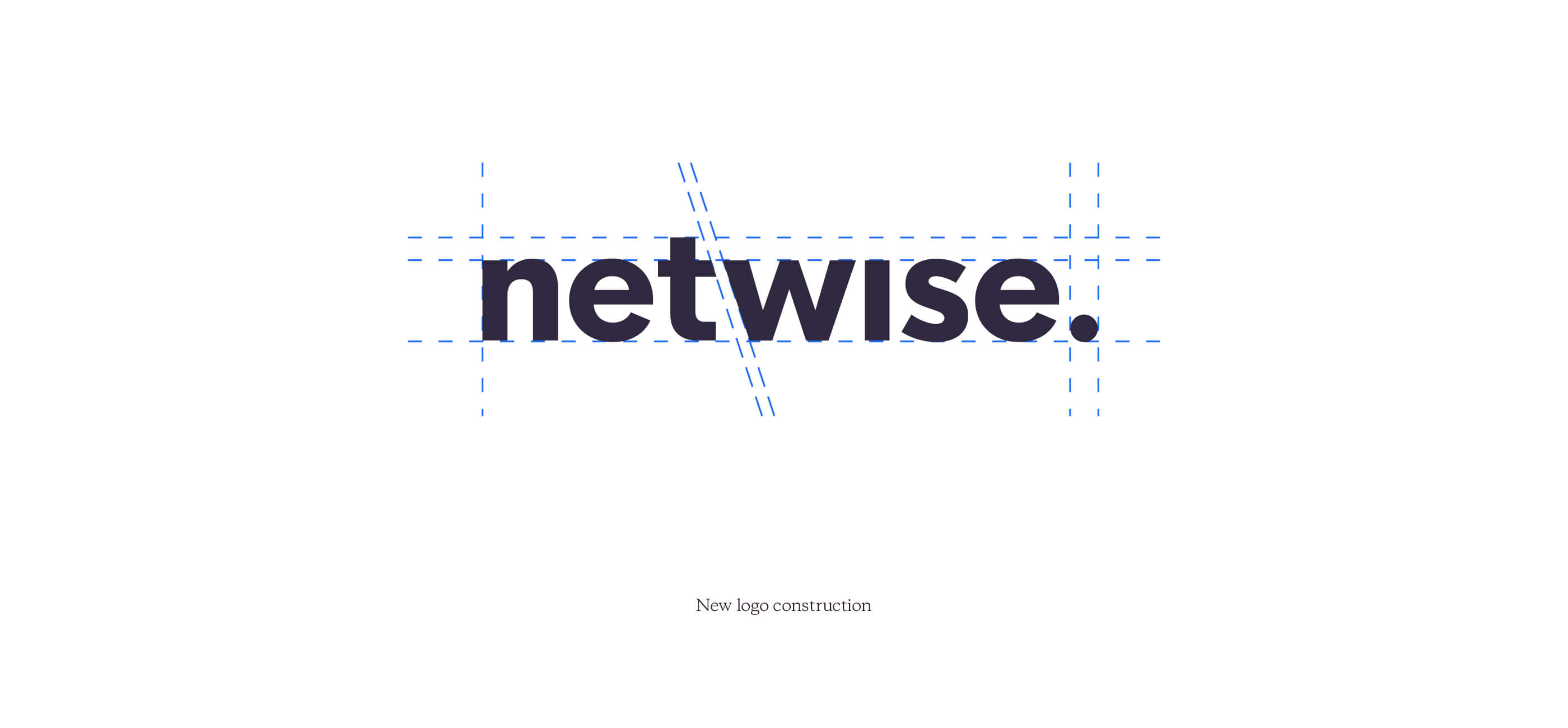
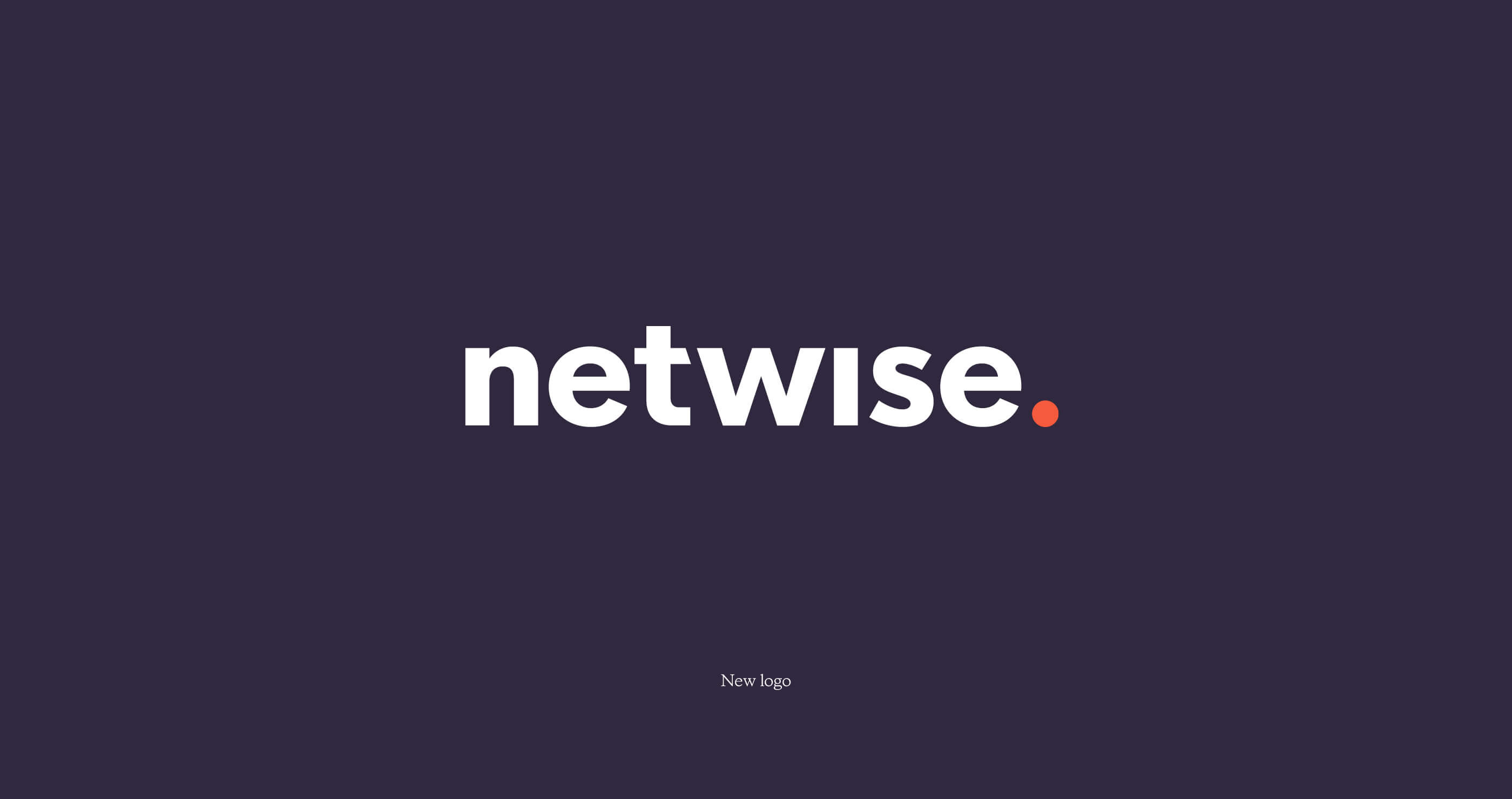
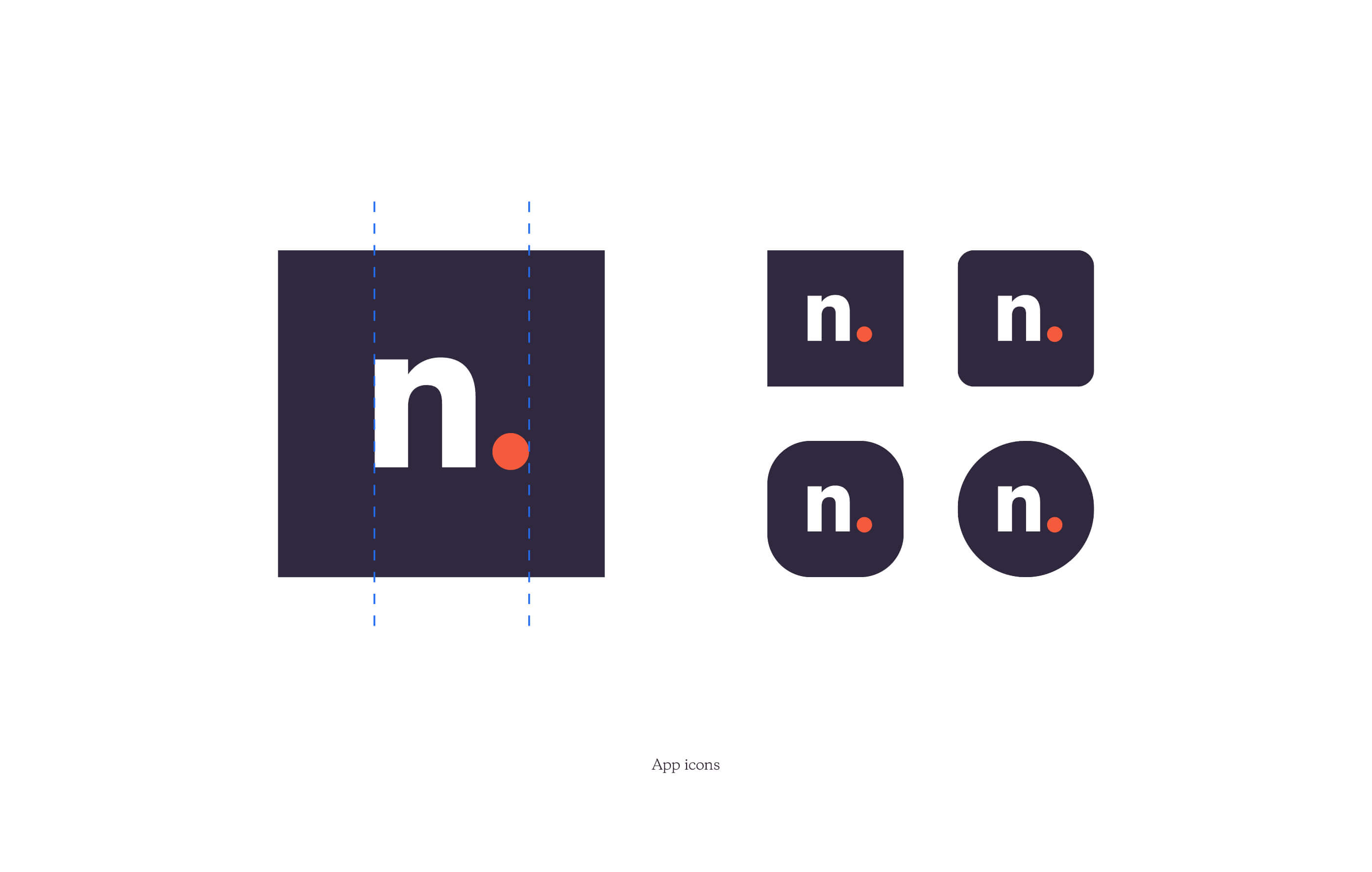
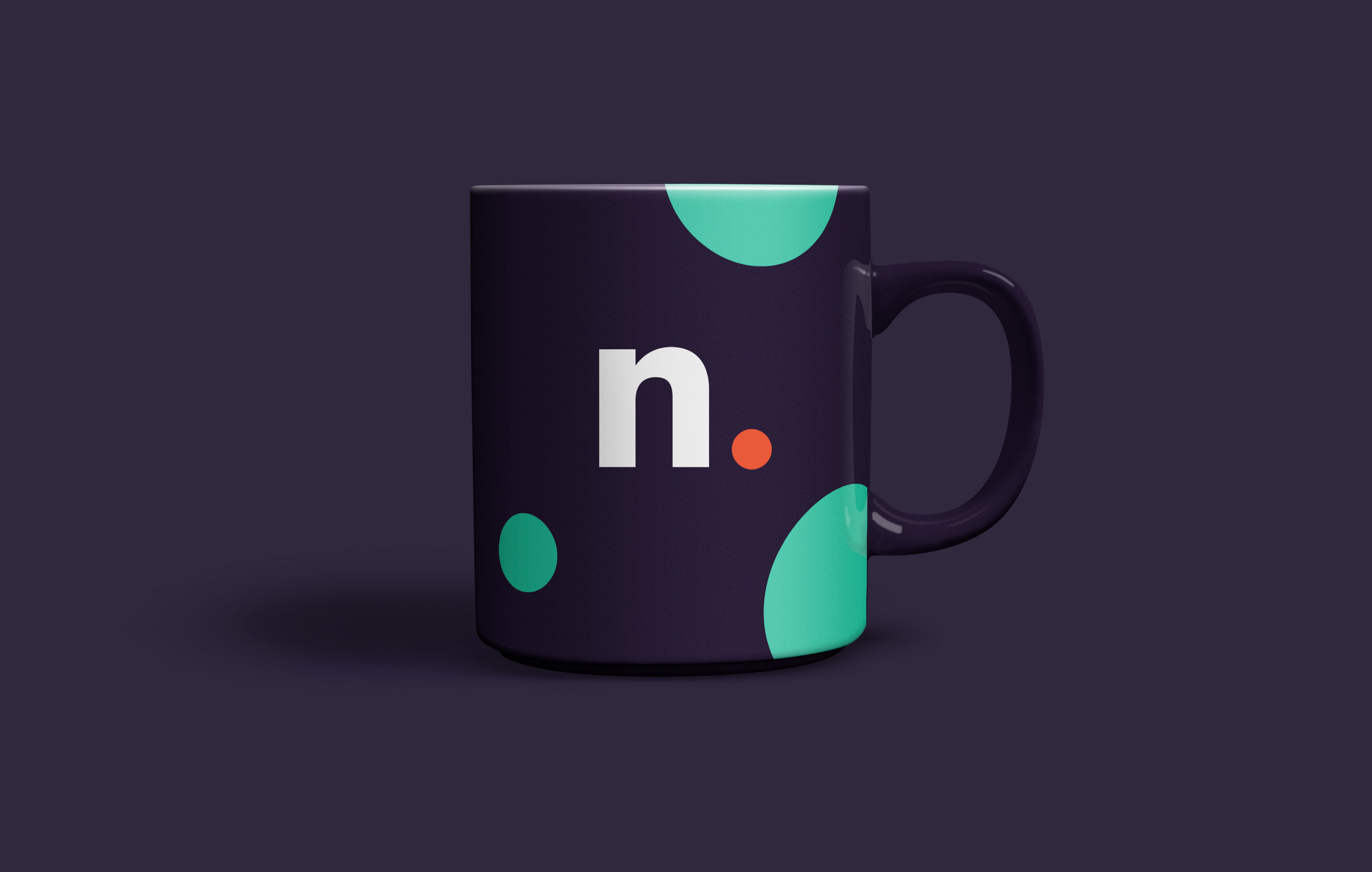
Taking inspiration from the most notable parts of Netwise’s existing brand – namely the primary orange in their colour palette and use of circular graphics – Juice London created a new logo and logomark that focused on being bold, confident, contemporary and masculine.
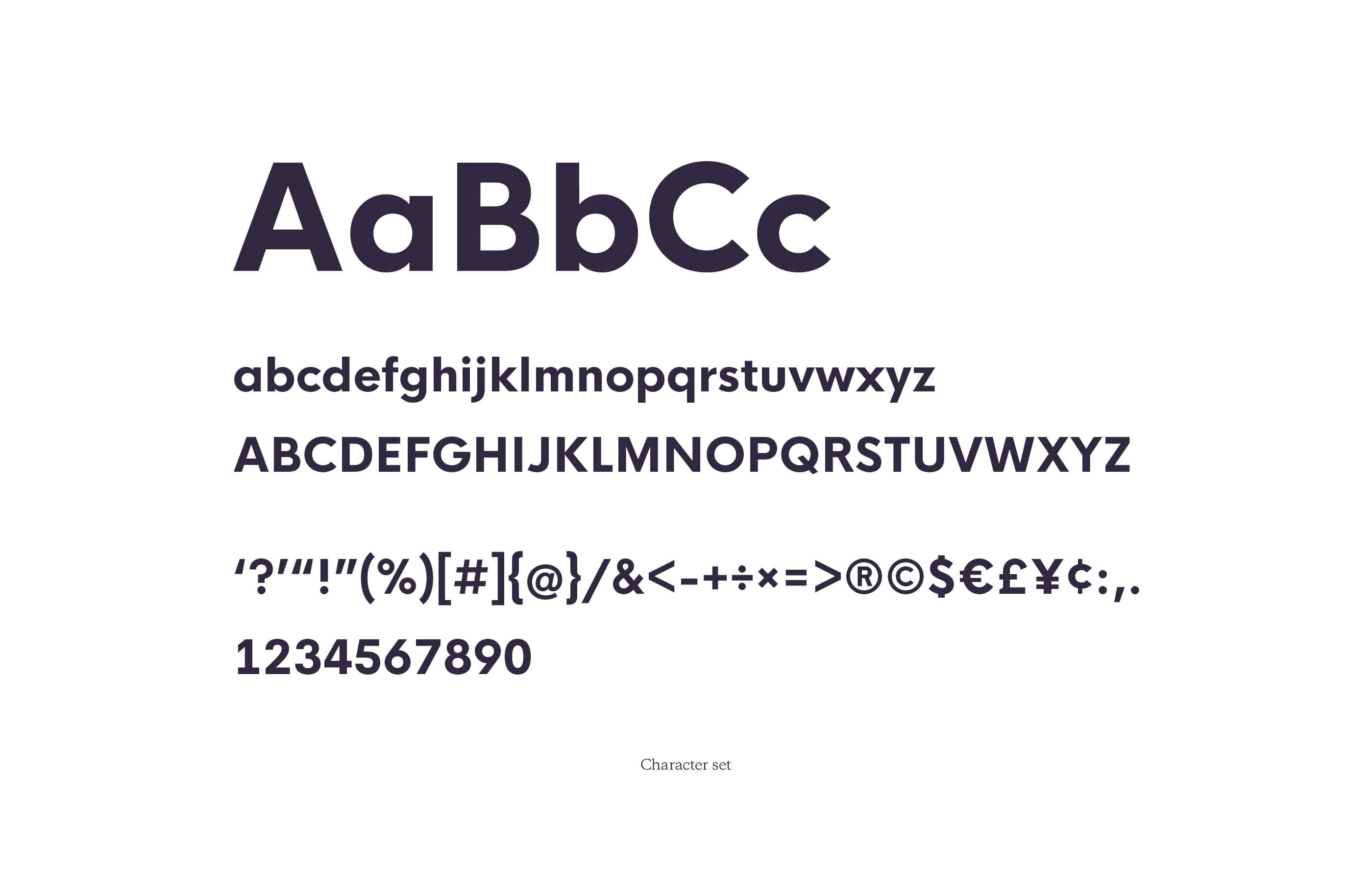
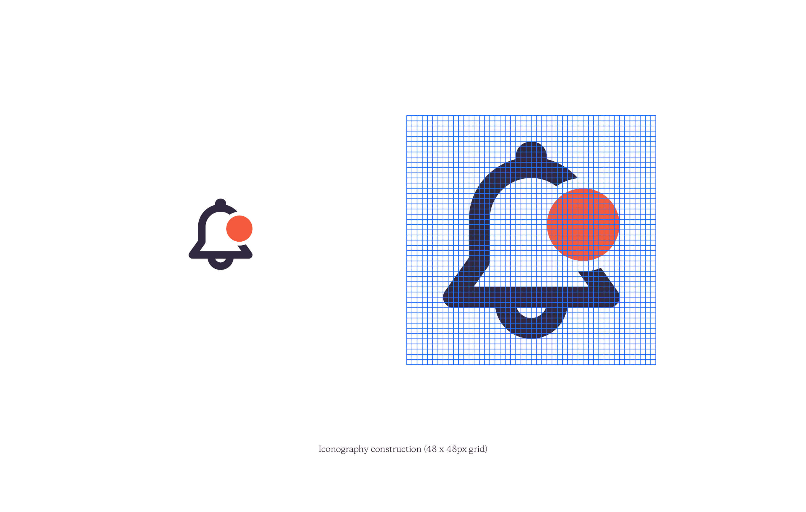
We then developed a flexible and powerful identity to support the logo, considering colour, typography, illustration, composition and iconography, and wrote a comprehensive style guide for the company to utilise.
Once complete, we were asked to overhaul their existing website, leaning heavily on user analysis and behavioural insights to shape the solution.
-
Services
Logo & identity design
Brand development & architecture
Style guidelines -
Client
Netwise Hosting